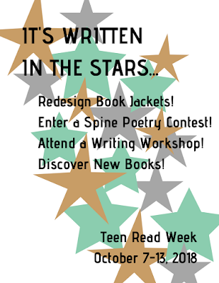
I used Canva for both a printable and digital flyer, though in reality, I'd stick with Canva just for digital use and/or if I needed a template. In the past, my design process has consisted of me sketching something out on paper, maybe printing out some text or graphics, then cutting and pasting the whole thing together. Obviously, this creates issues for repeating the process in the next month or year when a similar event happens (or if I am not around to recreate the promotional item), but if I am in charge of creative promotion, my talents lie in physical design - it's not that I'm digital design averse, I just have more skill in freehand design. The more I work digitally, the more intuitive these programs will feel, but I'll always enjoy creating with my hands.
Of course, I can (and do) start any digital work on paper, then do my best to translate it onto the screen, which is what I did here. I knew I wanted a starry background with text literally written "in"/onto it. I started with fewer stars, and put text inside, but that looked disorganized and was difficult to read/follow on the page. Instead, I made a path of stars across the page with the text over it, and I made an acrostic out of the main text. For the printable flyer, I kept the background white, with muted stars. The digital version has a black background, since I felt that would pop more onscreen.
I'd change a few things about this flyer in later versions (after more digital practice). Namely, I'd lean in to my acrostic more. I went back and forth on keeping it subtle, so you'd see it if you were looking, versus making those first letters larger/setting them apart in some way so it was obvious that "READ" is written in the stars, and after sitting with the design for a bit, now I wish I'd made it more obvious. I'd also play around more with the type - picking out fonts is both my least favorite and least exercised skill (again, since I prefer hand-lettering), but I'm sure I could create more contrast in the size or type.
What I truly appreciated about using Canva was the ease in which I could decide how to publish. I could download it as a PDF for printing, I could download it as a JPG or PNG for use online, and I could even embed the flyer straight to social media. Sharing a handcrafted flyer in all those ways would be difficult and look less professional, which means I'll be practicing lots more to bring my digital design skills up to speed!


Nice!
ReplyDelete